
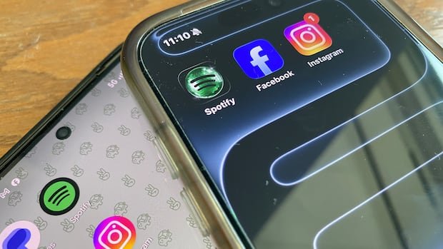
Spotify’s decision to replace its traditional green-and-black mobile app icon with a 3D disco ball design to commemorate its 20th anniversary has sparked a wave of backlash from users. The temporary logo swap, intended as a celebratory gesture, has incited strong negative reactions online.
Critics have likened the new logo to divisive topics like pineapple on pizza or the word “moist,” with some users expressing disdain for its appearance, labeling it as unattractive or pixelated. Calls for the removal of the designer behind the logo have also surfaced, while others have threatened to uninstall the app due to the change.
Despite the vocal criticism, a faction defending the new design has emerged, denouncing detractors as “haters” and supporting Spotify’s shift towards minimalistic design. In response to concerns raised about readability and branding issues with the anniversary logo, Spotify clarified that the change is temporary and the original icon will be reinstated soon.
Acknowledging the mixed reactions, Spotify assured users that the disco ball logo is a limited-time feature for their birthday celebration and that the regular icon will be restored once the festivities conclude. The company emphasized that not everyone may appreciate the glittery design, signaling a return to the standard logo in the coming week.

